Get started quickly
How to Install plugin
Download zip file
Before installing the Flyin Popup Plugin on your website, you need download the menx-fly-in-popup.zip file from elegantthemes.com.
Install and active plugin
Go to WordPress Dashboard >> Plugins >> click Add New Plugin
Then click Upload Plugin >> Choose File browse the menx-fly-in-popup.zip file and select it >> install now
After the plugin is installed, click Activate Plugin.
Once the plugin is activated, the Fly-in Popup module will be shown in the Divi Builder with other Divi modules.
How to use plugin
Enable Visual Builder
Click on Enable Visual Builder to edit the content toggle in visual view.
Add New Module
Click Add New Module to add module.
Search “fly-in popup” in Insert Module and click Fly-in Popup Toggle module to add the new module.
Edit Module
Click Module Settings to edit the module.
Click Content to edit toggle content.
Click Design to edit toggle style.
How to edit Content
Trigger Type
Go to Content >> Trigger Style in Module Settings,
Go to Content >> Flyin Button in Module Settings, input your button text in Button Text.
Go to Flyin Button >>Show Default Box Shadow. Here you can choose whether to display default box shadow of the flyin button.
Popup Content
1. Before usage of this Popup Content Function, you’d better:
>>>Create your layout and then save the layouts to use in the Divi Library.
>>>Or import our free 10+ Demo Layouts from Fly-in Popup Demo.
For how to import and edit the Demo layout, please refer to:
2. Go to Content >> Popup Content in Module Settings.
Show Circle Background
Go to Content >> Circle Background in Module Settings, here you can choose whether to display top and bottom circle background under the popup content on the front-page.
Popup Position
Go to Content >> Popup Position in Module Settings,here you can choose where to place the flyin popup on the front-page: bottom left or bottom right.
How to edit Flyin Button Style
Button Text & Background
Go to Design >> Flyin Button Text in Module Settings. Here you can edit the text font, color ,box-shadow for the flyin button.
Go to Content >> Background in Module Settings. Here you can edit the background for the flyin button.
Button Hover Effect
Go to Design >> Flyin Button Hover Effect in Module Settings. Move the slider or enter a value to increase or decrease the translateY of the flyin button hover effect.
Button Border & Box-shadow
Go to Design >> Border in Module Settings. Here you can edit the border for the flyin button.
Go to Design >> Box-Shadow in Module Settings. Here you can edit the Box-shadow for the flyin button.
Button Size & Spacing
Go to Design >> Border in Module Settings. Here you can edit the border for the flyin button.
Go to Design >> Box-Shadow in Module Settings. Here you can edit the Box-shadow for the flyin button.
How to edit Close Icon
Close Icon Color
Go to Design >>Close Icon>> Close Icon Color in Module Settings. Here you can define a custom color to use for the close icon.
Go to Design >>Close Icon>> Close Icon Background Color in Module Settings. Here you can define a custom background color to use for the close icon.
Close Icon Position
Go to Design >>Close Icon>> Close Icon Position in Module Settings. Here you can choose where to place the close icon: inside or outside of the popup content
How to edit Circle Background
Circle Background Color
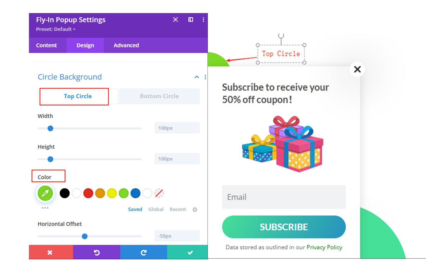
Go to Design >>Circle Background>> Top Circle>>Color in Module Settings.Here you can define a custom color to use for the top circle.

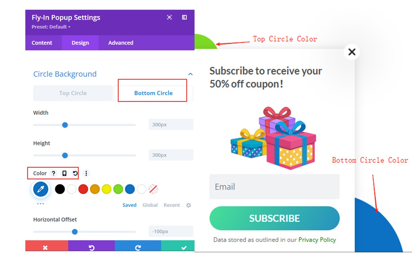
Go to Design >>Circle Background>> Bottom Circle>>Color in Module Settings.Here you can define a custom color to use for the bottom circle.

Circle Width & Height
Go to Design >>Circle Background>> Top Circle>>Width / Height in Module Settings.Here you can define a custom width/height to use for the top circle.
Warning: Adjusting the height and width requires adjusting the horizontal and vertical offsets at the same time.
Go to Design >>Circle Background>> Bottom Circle>>Width / Height in Module Settings.Here you can define a custom width/height to use for the bottom circle.
Circle Horizontal Offset
>>Top Circle Horizontal Offset
Go to Design >>Circle Background>> Top Circle>>Horizontal Offset in Module Settings.
>>Bottom Circle Horizontal Offset
Go to Design >>Circle Background>> Bottom Circle>>Horizontal Offset in Module Settings.
Move the slider or enter a value to increase or decrease the horizontal offset of the bottom circle background.
Circle Vertical Offset
>>Top Circle Vertical Offset
Go to Design >>Circle Background>> Top Circle>>Vertical Offset in Module Settings.
.
>>Bottom Circle Vertical Offset
Go to Design >>Circle Background>> Bottom Circle>>Vertical Offset in Module Settings.
The minimum vertical offset value cannot exceed the negative value of the height, otherwise the bottom circle background will not be visible.


