How to Install
This template is built as a Divi Section
Please make sure you import it into the Section area in Divi, not a row or module.
Download and unzip file
Before installing the Divi Pricing Tables Sections on your website, you need download the pricing tables zip file from elegantthemes.com, and then extract it to the .json files on your desktop.
There are two folders for your choice in the unzipped file folder:
- Pricing-Tables-Section-No-Toggle: If you don’t need Toggle, please use it.
- Pricing-Tables-Section-With-Toggle: If you need Toggle, please use it.
Import unzipped file to Divi Library
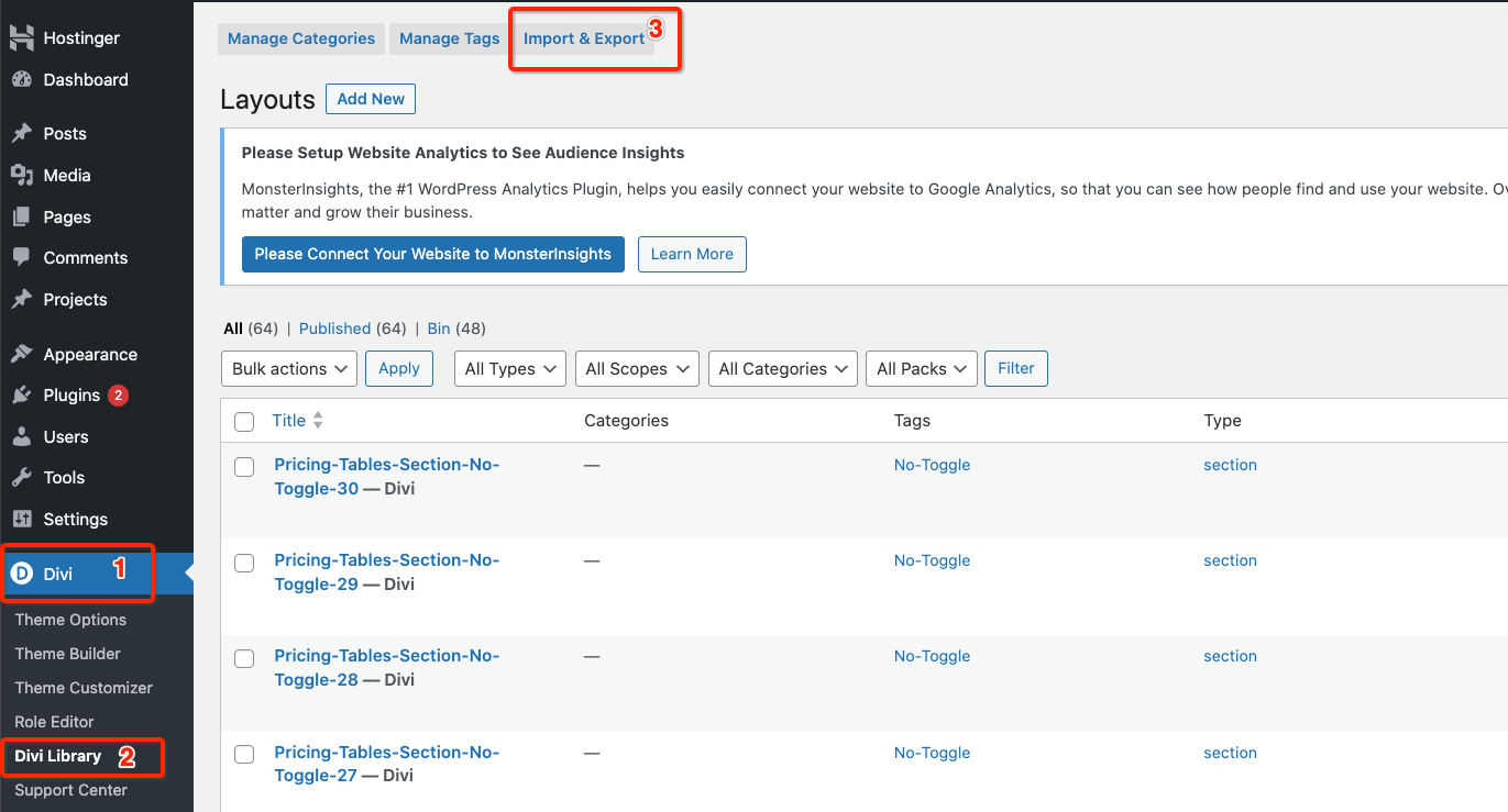
Go to the WordPress dashboard . On the WordPress sidebar, hover over “Divi” and click “Divi Library”. Then click “Import/Export”.
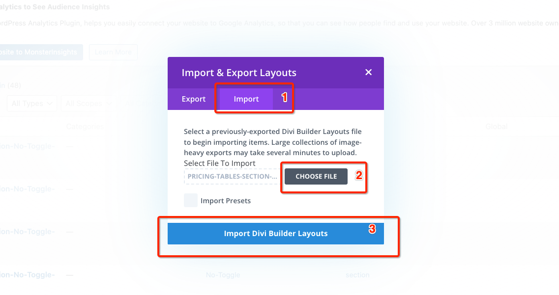
This will show the ‘Import/Export’ window, click the “Import” tab and then click “CHOOSE FILE” to choose the unzipped .json files you want to use, and finally click “Import Divi Builder Layouts”.
A. json file contains 10 pricing table sections. Please review the Demo Website to see the layout number of the pricing table section you want to use.
- If you need pricing tables with Toggle option, please import the files: Pricing-Tables-Section-With-Toggle-XX-XX.json.
- If you don’t need Toggle option, please import the files: Pricing-Tables-Section-No-Toggle-XX-XX.json.
Add pricing table section on your site
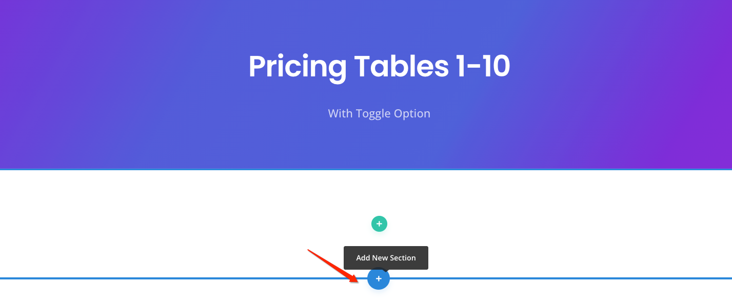
You can create a new page or modify an existing page, and then click the blue plus button to add a new section.
This template is a Section:
Important: Make sure the template is imported into the right Section in Divi Builder.
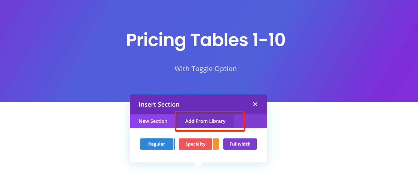
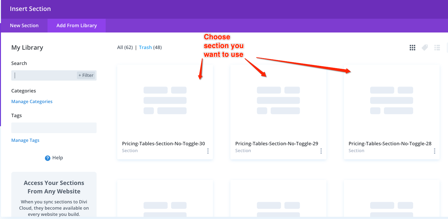
Then a pop-up window will show on the screen, containing two options. Select “Add From Library” to choose the imported section you want to use.
Insert Section window will show all the layouts that you have previously imported to your library. You can choose and click the section you want.
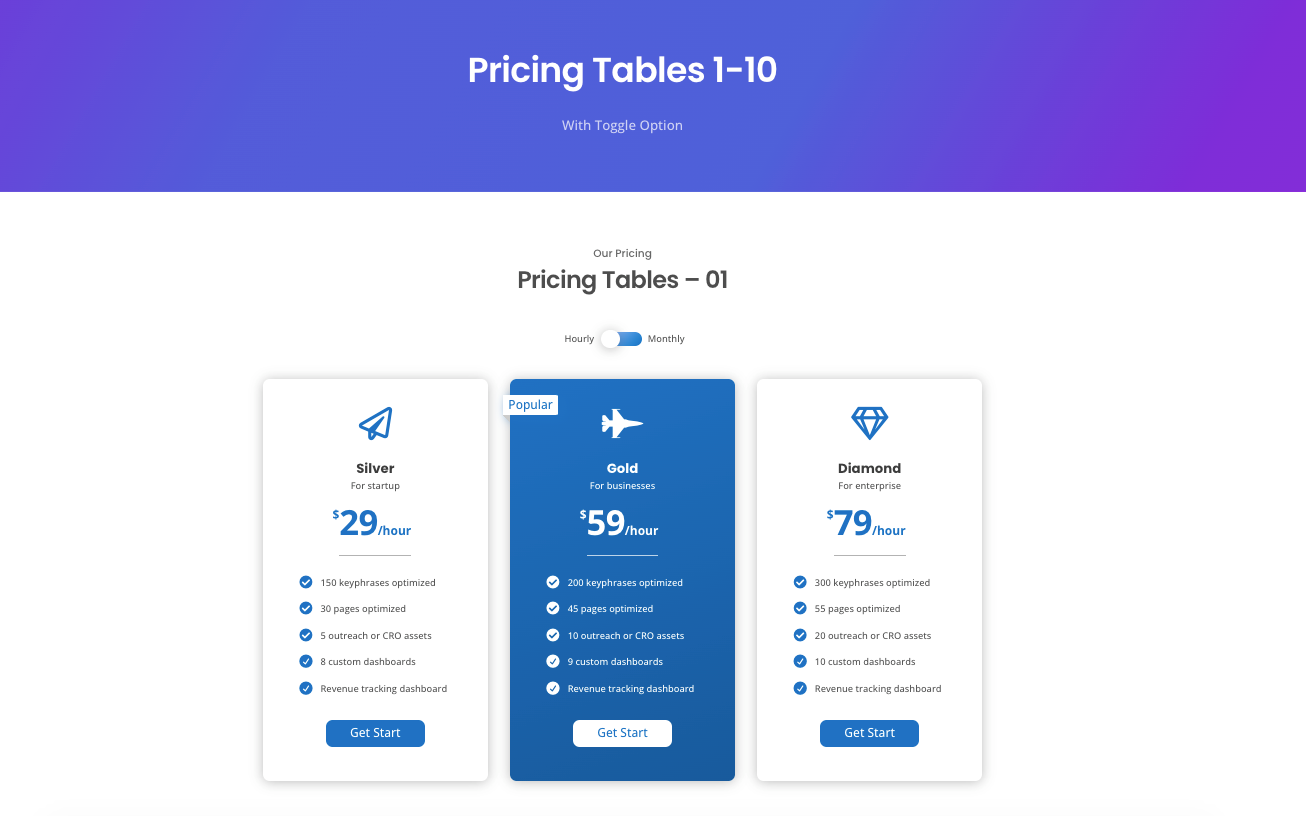
Please review the Demo Website to see the layout number of the pricing table section you want to use.
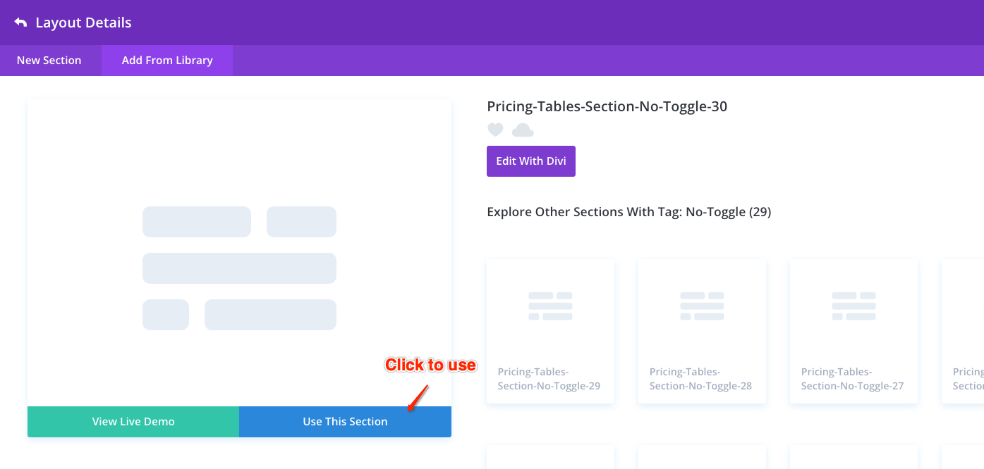
Click “Use This Section” to import and use this section on your site.
Don’t forget to save the page
How to edit content and styles
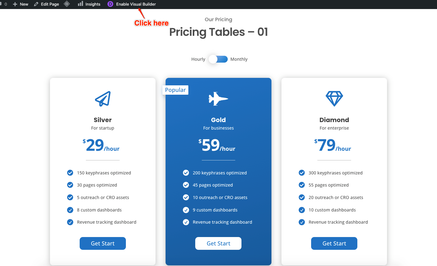
Enable Visual Builder
Click “Enable Visual Builder” to edit the content and styles of the section in visual view.
Module Settings
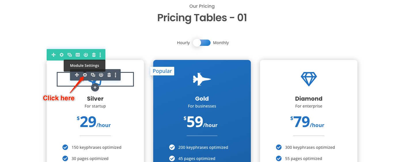
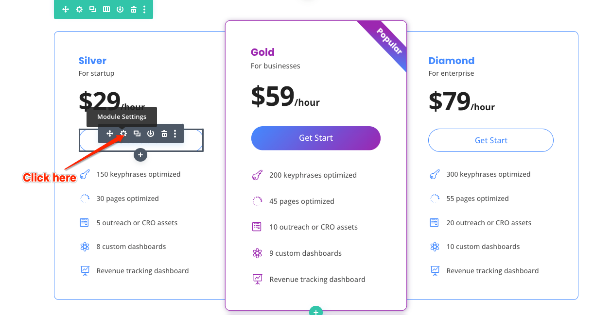
Hover over the module you want to edit, then you can see the module menu. Select “Module Settings” to edit the icon, text, pricing tables, blurb, and button module.
Edit Pricing Tables Module
There are two kinds of pricing table in layouts bundle:
- Text only: change the text content only.
- Divi default Pricing tables module: need to edit the module through “Module Settings”.
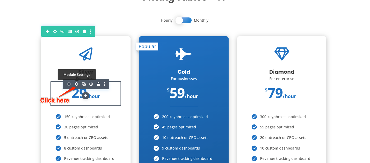
Firstly, click “Module Settings” to edit the pricing tables module.
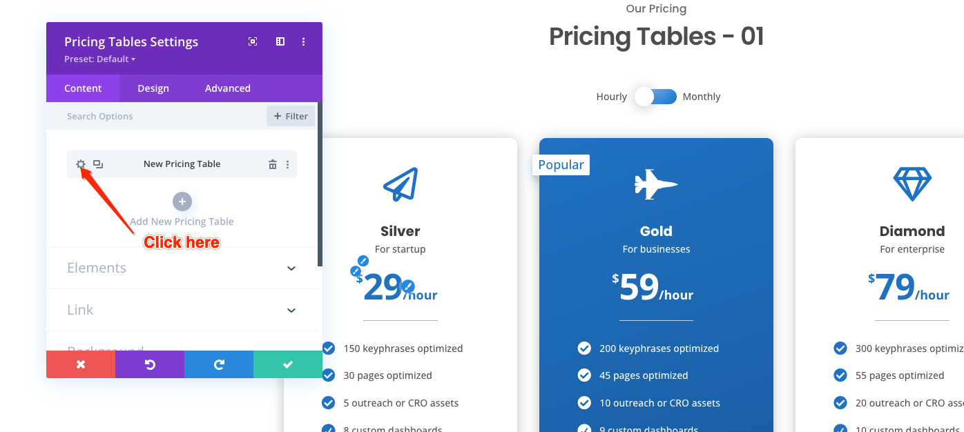
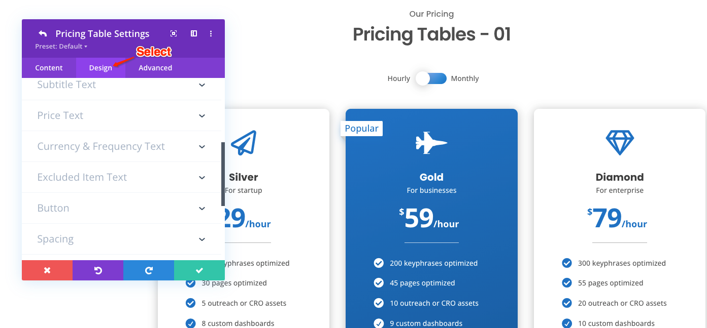
Then, click “Settings” to edit pricing tables content and styles.
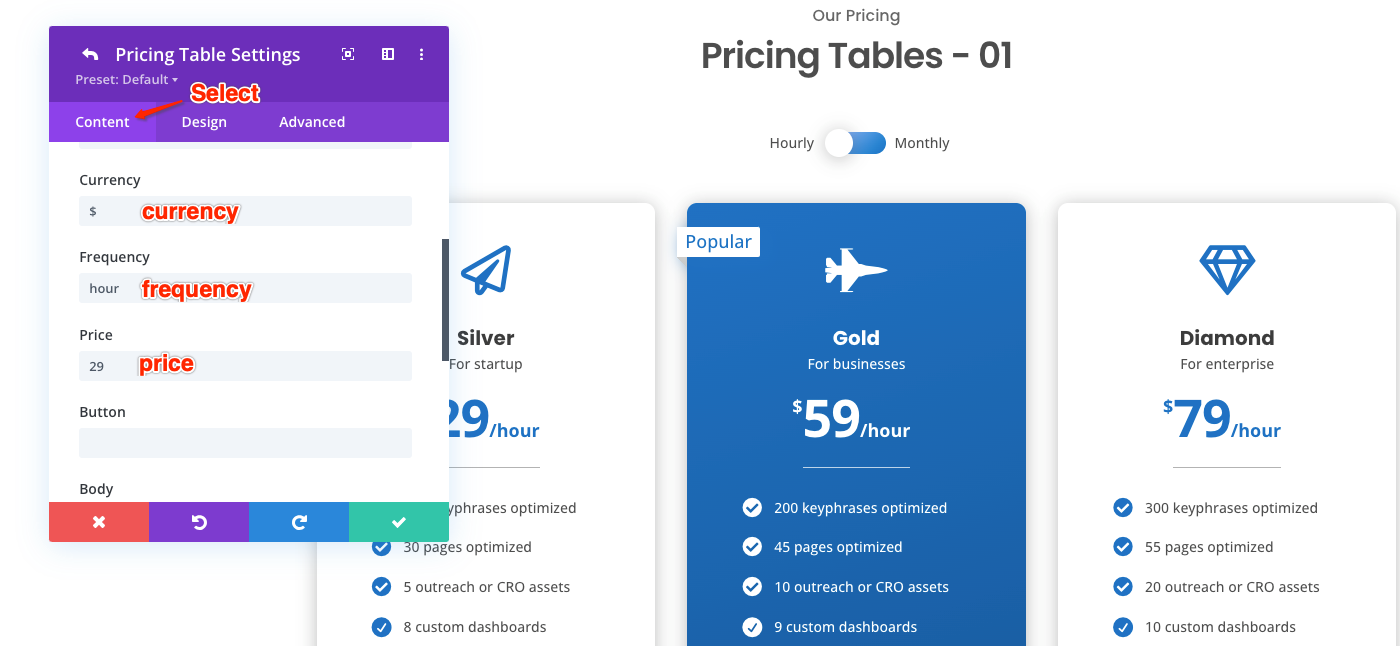
Select “Content” tab to edit the content of the price, frequency, and currency.
Select “Design” tab to edit the design style of the price, frequency, currency, spacing and border.
Edit Blurb Module
Firstly, click “Module Settings” to edit the blurb module.
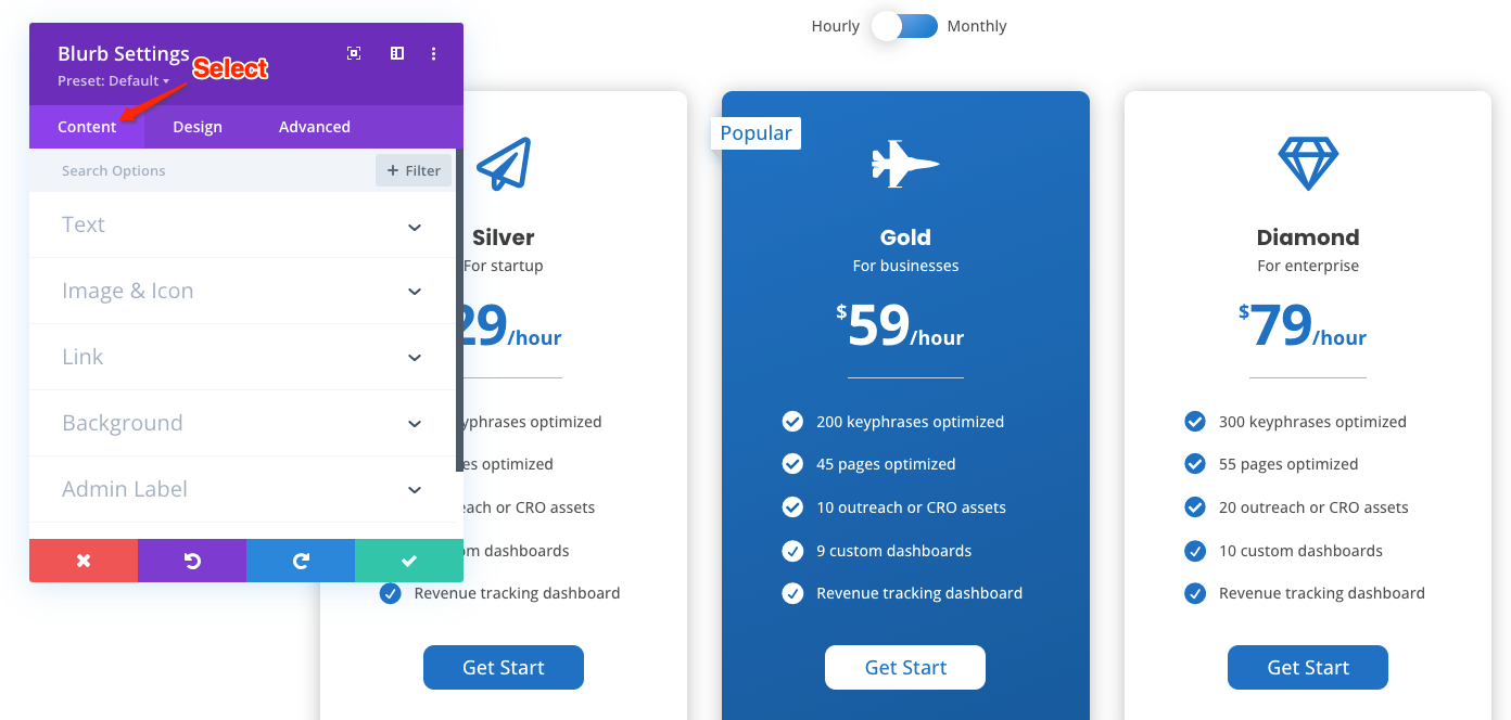
Select “Content” tab to edit the content of the blurb’s text and icon.
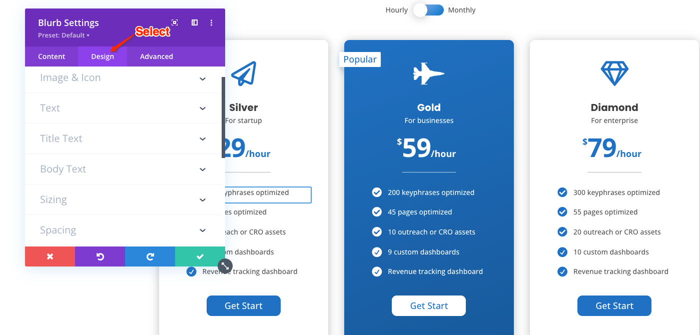
Select “Design” tab to edit the design style of the blurb’s text, icon and spacing.
Edit Button Module
Firstly, click “Module Settings” to edit the button module.
Select “Content” tab to edit the content of the button’s text and link.
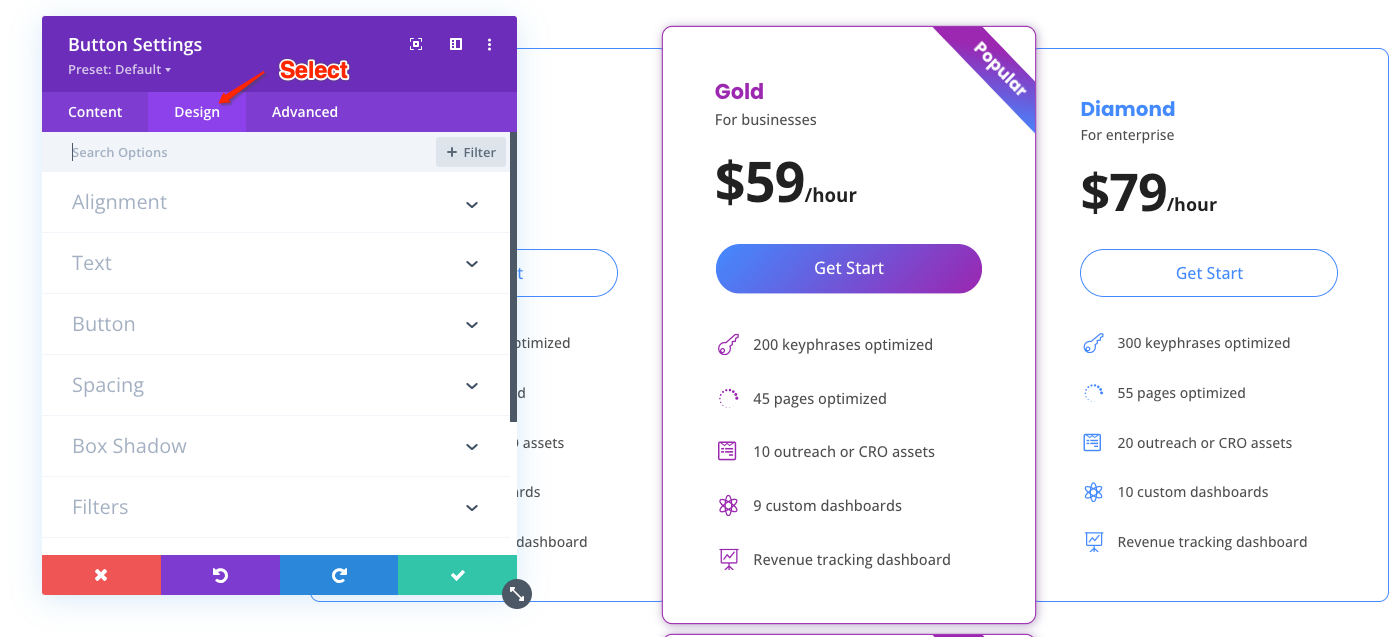
Select “Design” tab to edit the design style of the button’s text, border, background, box shadow and spacing.
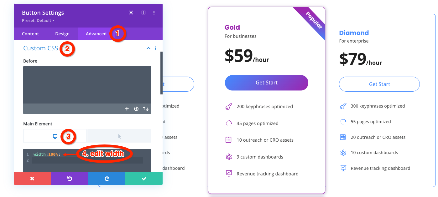
Some buttons’ style is set to 100% width. If you want to change the width, you can go to Advanced tab >> Custom CSS >> Main Element >> Desktop to edit the CSS code of the button’s width.
How to edit Toggle
Edit Monthly and Yearly Row
In Toggle design, there are two default switching mode:
- From Hourly to Monthly
- From Monthly to Yearly
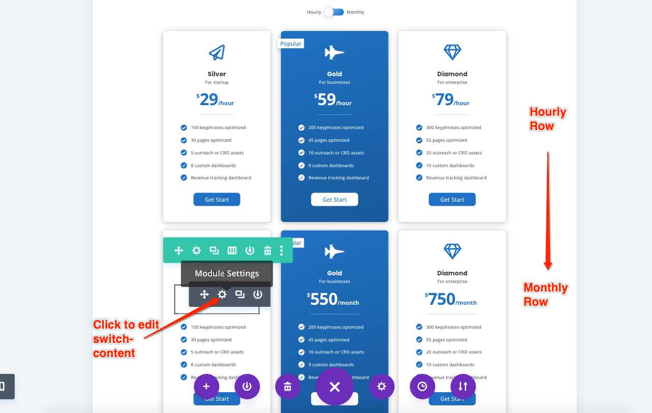
Enable Visual Builder, the switching rows are both displayed in the Visual Builder View. You can edit the content you want to switch.
Hover over the module you want to edit, then you can see the module menu. Select “Module Settings” to edit the icon, text, pricing tables, blurb, and button module.
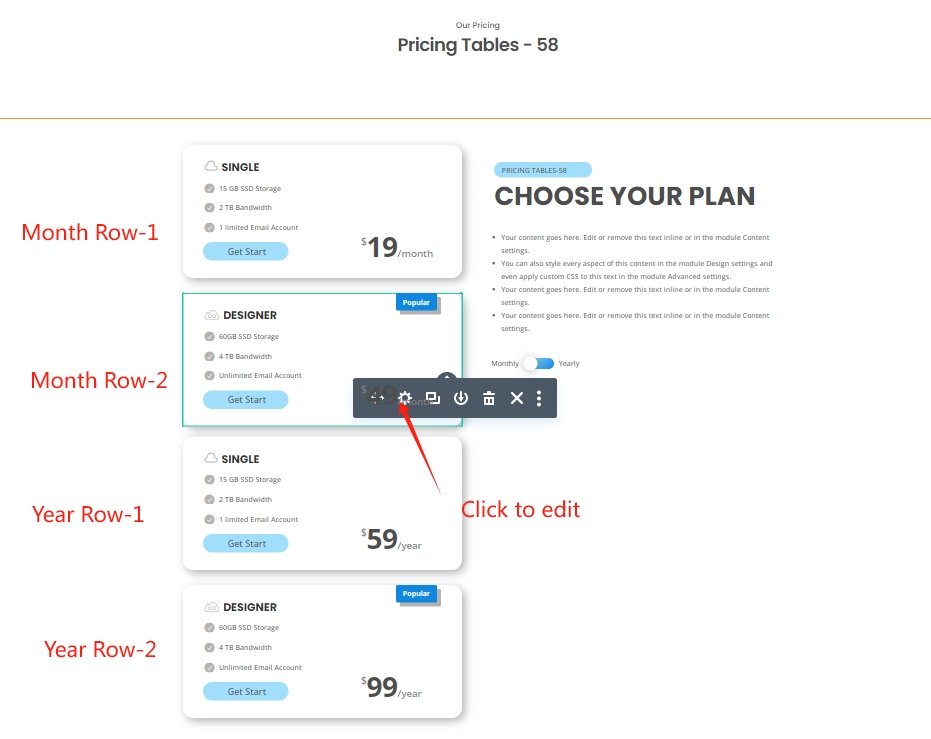
Price 57-60 are a little different
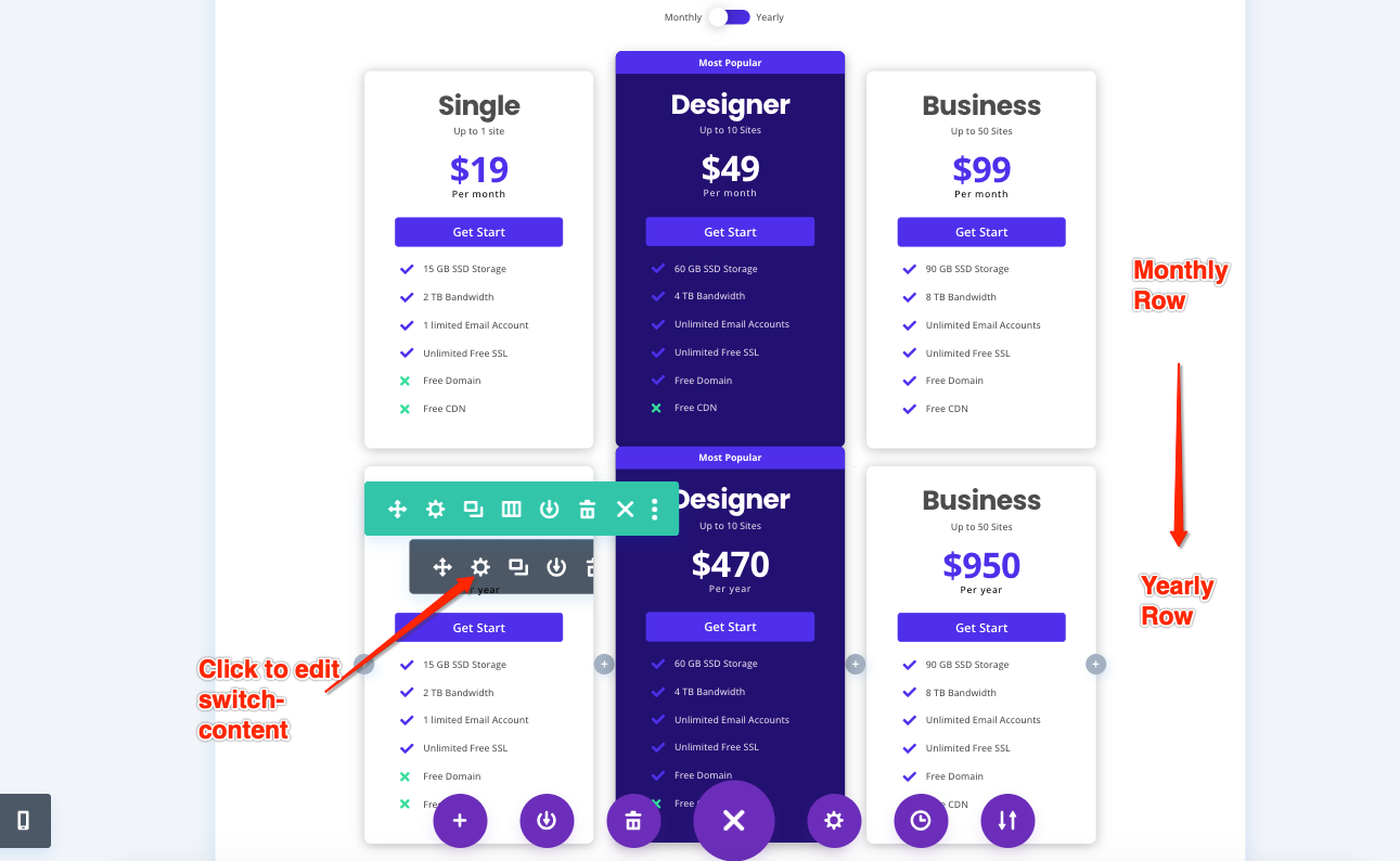
There are two month rows and two year rows, both on the side.
Hover over the module you want to edit, then you can see the module menu. Select “Module Settings” to edit the icon, text, pricing tables, blurb, and button module.
Go to Wireframe View
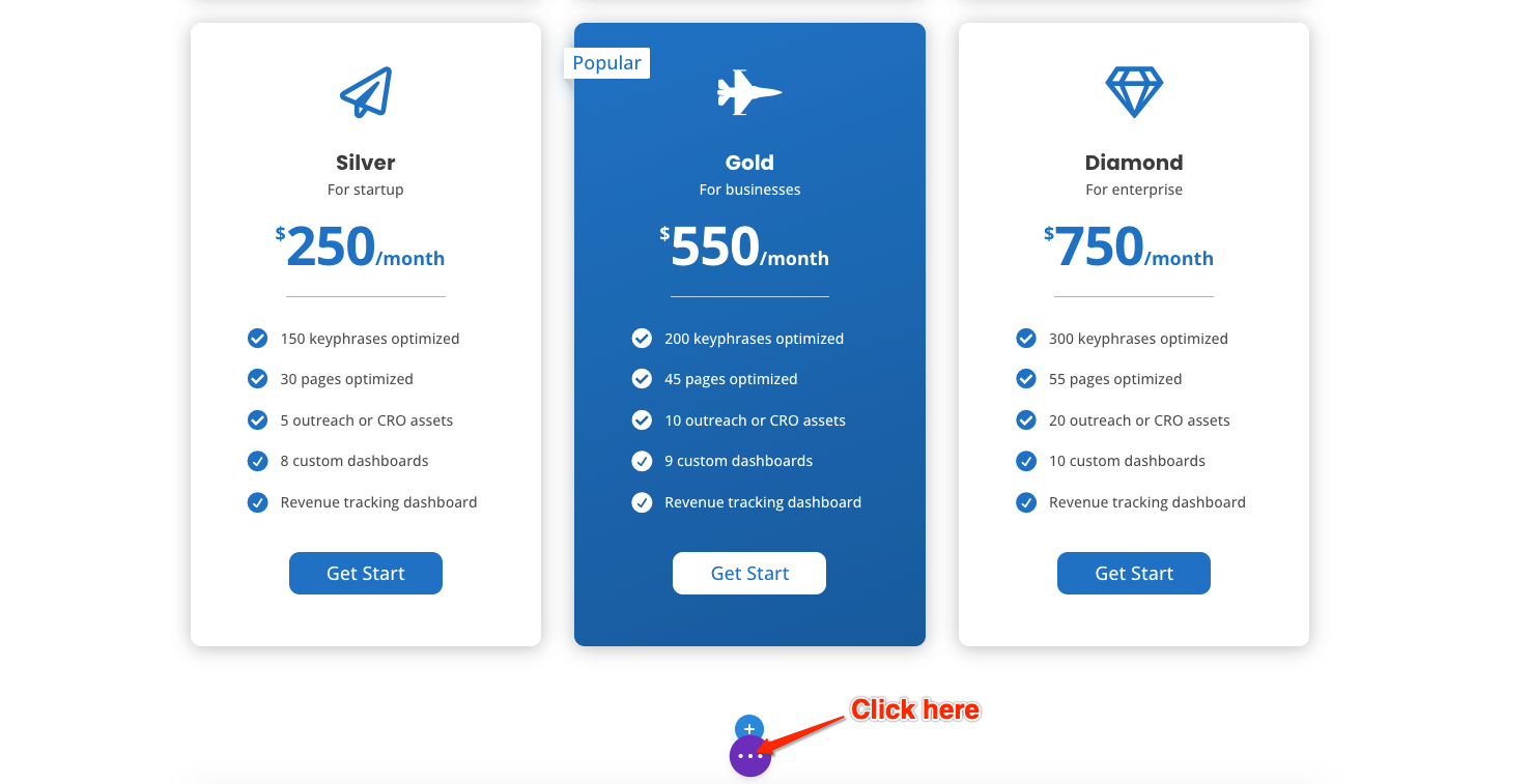
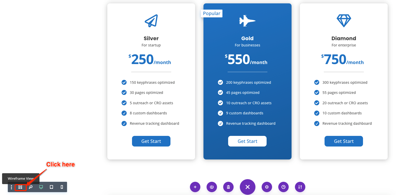
First, click the navy-blue button at the bottom.
Then click “Wireframe View” button at the bottom left.
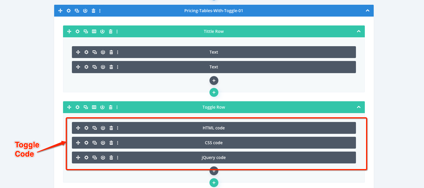
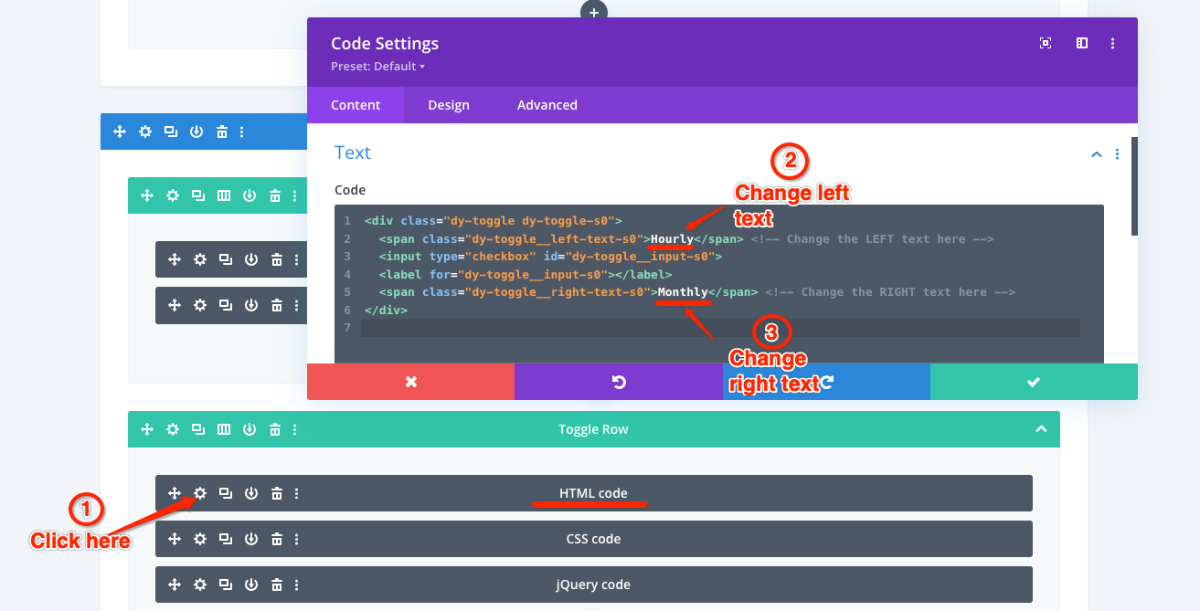
In Wireframe View, there are three Code Modules: HTML code, CSS code, and jQuery code. To edit the toggle’s content and styles, you can click the Settings of the Code Module which you want to edit.
Price 51-60 are a little different
The HTML code,CSS code, and jQuery code are all on the side.
Change Toggle’s text content
Click the HTML code module settings and then replace the left and right default text with your text.
Left text code:
<span class=”dy-toggle__left-text-sX”>Hourly</span> <!– Change the LEFT text here –>
Right text code:
<span class=”dy-toggle__right-text-sX”>Monthly</span> <!– Change the RIGHT text here –>
Note:
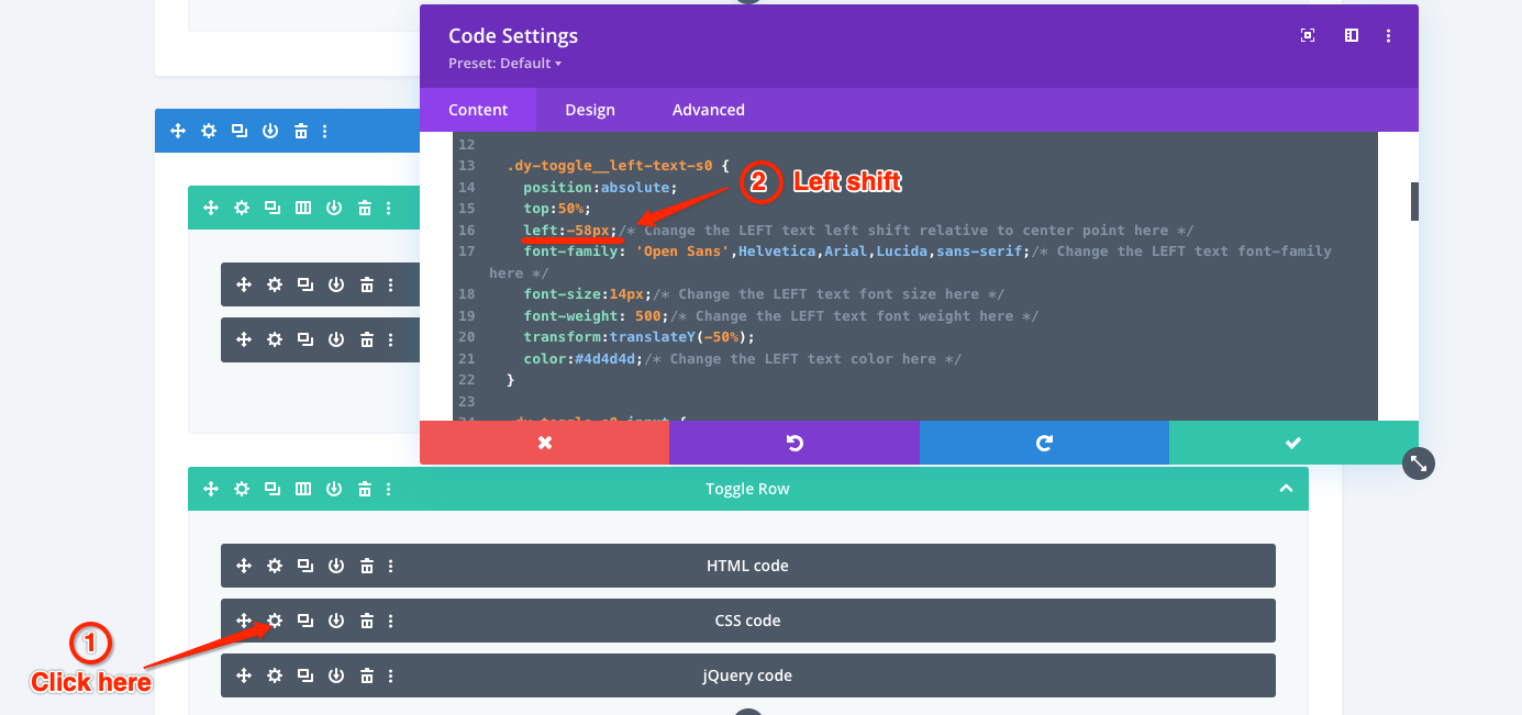
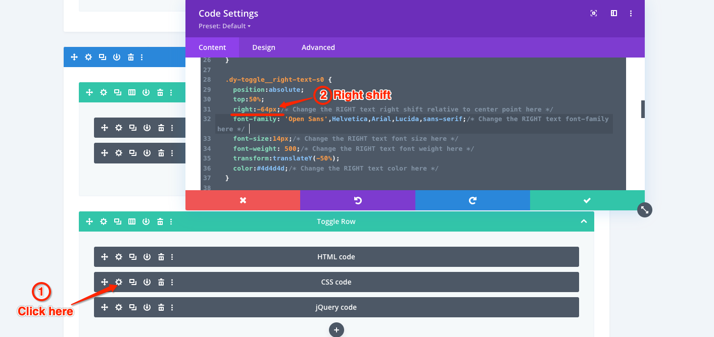
If you want to change the toggle’s left and right text, you also need change the values of the left and right shift in the CSS code module.
There are two sets of default toggle texts:
- Left text: Hourly, Right text: Monthly
Suggest the left shift is -58px, the right shift is -64px.
- Left text: Monthly, Right text: Yearly
Suggest the left shift is -68px, the right shift is -50px.
Left shift code:
.dy-toggle__left-text-sX {
left:-58px;/* Change the LEFT text left shift relative to center point here */
……
Right shift code:
.dy-toggle__right-text-sX{
right:-64px;/* Change the RIGHT text right shift relative to center point here */
……
Change Toggle’s text css styles
Change the left text color and styles
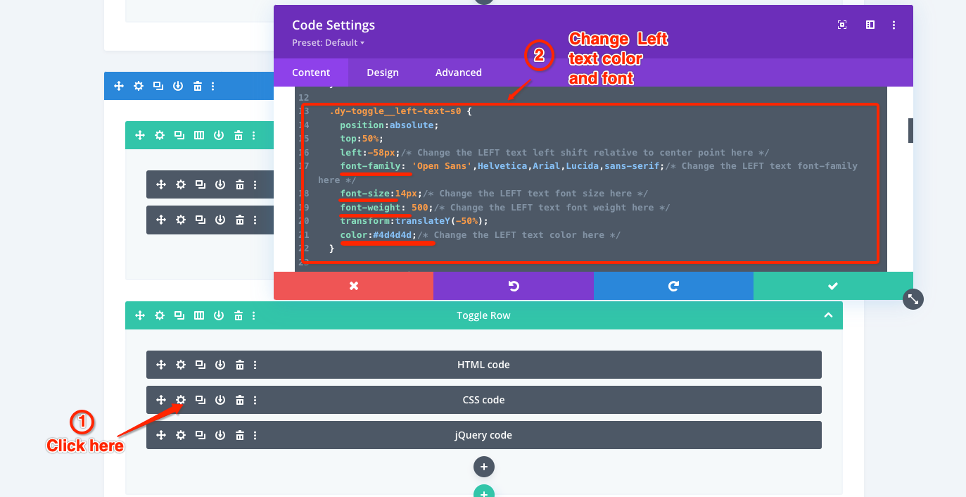
Click the CSS code module settings and then replace the left text color with your color. You can also change the other text styles: font-family, font-size, font-weight.
Left text code:
.dy-toggle__left-text-sX{
font-family: XXXX;
font-size:XXXX;
font-weight: XXXX;
color:#XXXXXX;
}
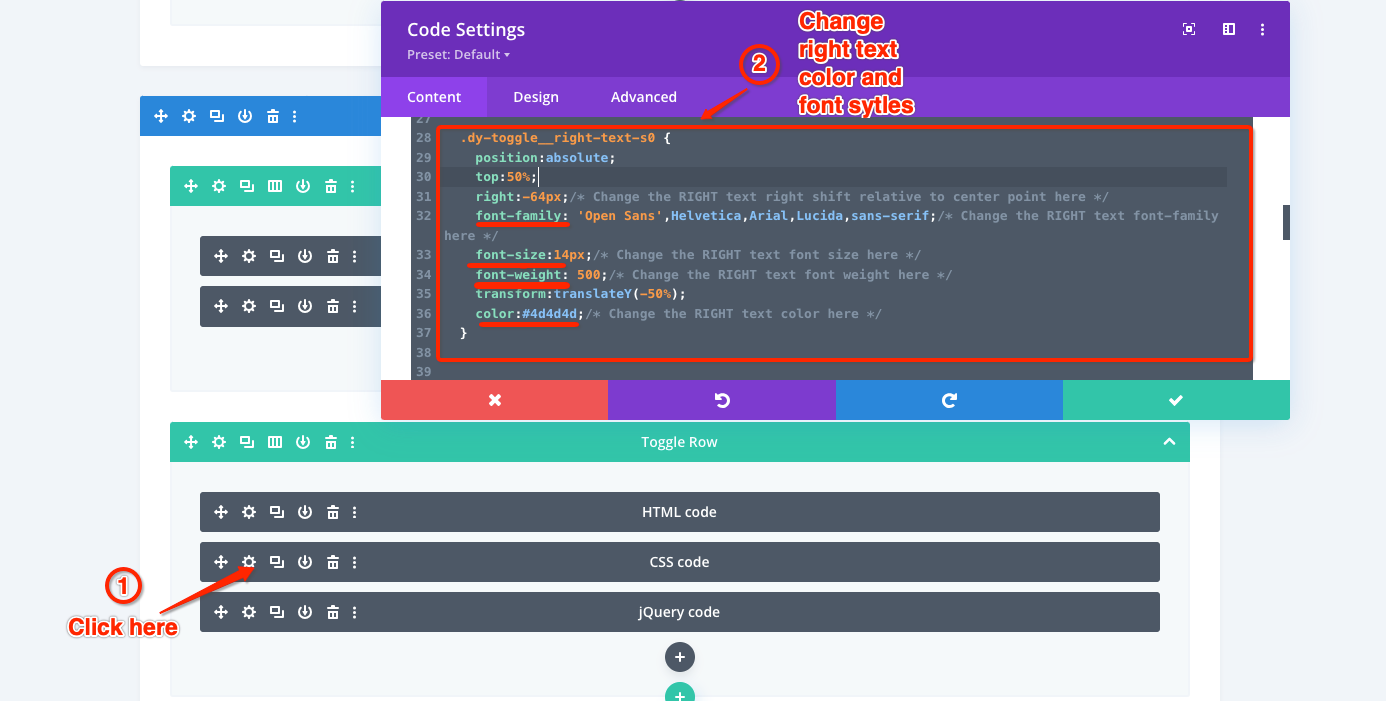
Change the right text color and styles
Click the CSS code module settings and then replace the right text color with your color. You can also change the other text styles: font-family, font-size, font-weight.
Right text code:
dy-toggle__right-text-sX {
font-family: XXXX;
font-size:XXXX;
font-weight: XXXX;
color:#XXXXXX;
}
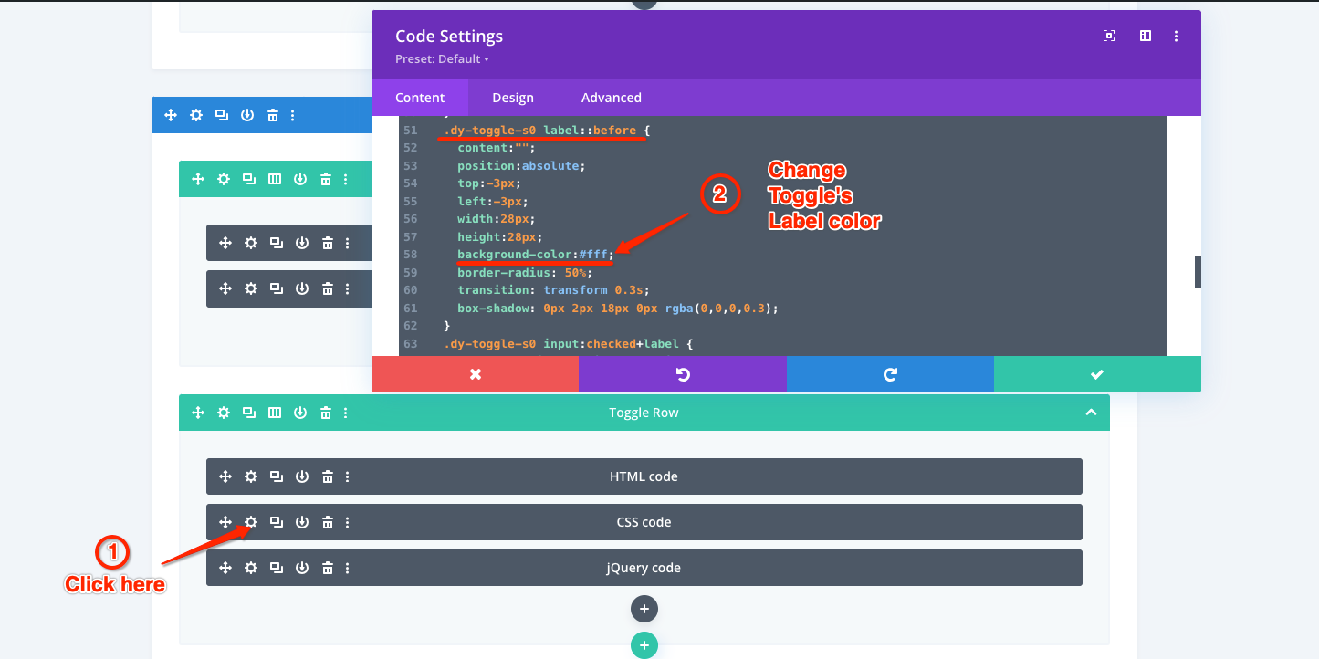
Change Toggle’s label color
Click the CSS code module settings and then replace the toggle label color with your color.
Toggle’s label color code:
.dy-toggle-sX label::before {
background-color:#XXX;
…
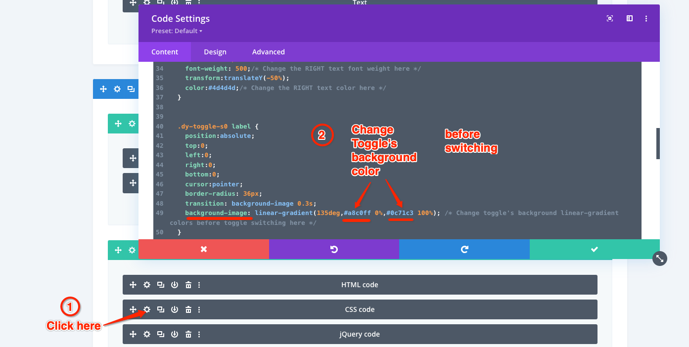
Change Toggle’s background color before switching
Click the CSS code module settings and then replace the toggle’s background color before switching with your color.
Since toggle’s background color is linear-gradient, you need change two colors for 0% and 100%. If only one color is needed for the toggle’s background color, you can replace two colors for 0% and 100% with the same color.
Toggle’s background color code:
.dy-toggle-sX label {
background-image: linear-gradient(135deg,#XXXXXX 0%,#XXXXXX 100%);
…
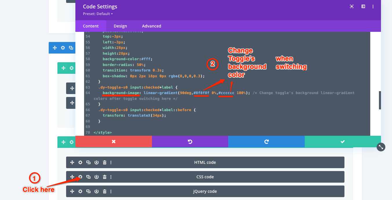
Change Toggle’s background color when and after switching
Click the CSS code module settings and then replace the toggle’s background color when switching with your color.
Since toggle’s background color is linear-gradient, you need change two colors for 0% and 100%. If only one color is needed for the toggle’s background color, you can replace two colors for 0% and 100% with the same color.
Toggle’s background color code:
.dy-toggle-sX input:checked+label {
background-image: linear-gradient(90deg,#XXXXXX 0%,#XXXXXX 100%);
}


